SimpleReach
Systems and Product design
Is there a way to create a new stream of revenue for publishers? How can marketers and PR agencies have actual real data that they can use for their clients?

I was initially brought on to help develop a new design system for SimpleReach 2.0. SimpleReach has had a long legacy with publishers and has an enormous amount of data that has been gathered for years (7 to be exact). Publishers, like The Atlantic, Forbes and Time Inc, are all using our product to better understand what their readers were doing with their content.
SimpleReach 1.0 had been around for a long time now, with little to no updates to their design at all. This outdated design didn't translate well to what modern data analytics applications were doing today.
After working a few weeks and catching up with the new role, the CEO had a sudden realization of an untapped market that we can take advantage of with the data we have.
The idea was very simple: connect publishers to marketers that want their data, which was all on our application already. Marketers can search for any type of content based on any search they typed into our system. Our advantage was that we had already been implemented into a large publisher network that has been gathering data for years.
Publishers do nothing except give us permission to share their data, which they will be compensated for from the marketer that wants to purchase this information.
Marketers use our application to search for any kind of content they want within our publisher network and pay publishers (also a small fee for us) for that data. This gives them an advantage for their clients with insights they never had before.
The close relationship we had with publishers made it very easy and straightforward to ask them a bunch of questions about our current SimpleReach product.
We asked them questions about which parts of SimpleReach they thought were useful and used the most. Along with asking for their insight on which parts of the app they did not think we’re needed in the first place. We wanted to know what their goals and workflows were when using our product.
We took this feedback and applied it to the features we were going to create and the wireframes we built for our application.
Since we wanted to launch by the end of the year, we needed to build only what was absolutely necessary.
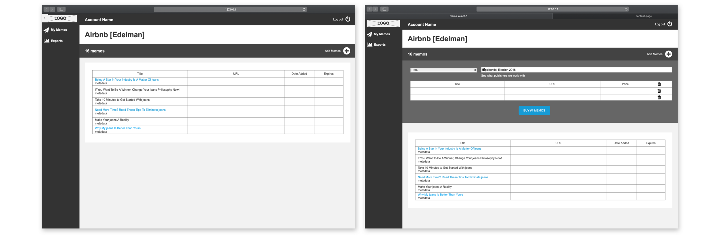
We needed to build out the specific use case of:
- User coming and logging in
- User searching for an article
- User purchasing the article
- User seeing the data analytics dashboard of that article.
Our publishers needed no work done, all they had to do was give us permission to sell their data on their behalf while they start to generate revenue from those purchases.
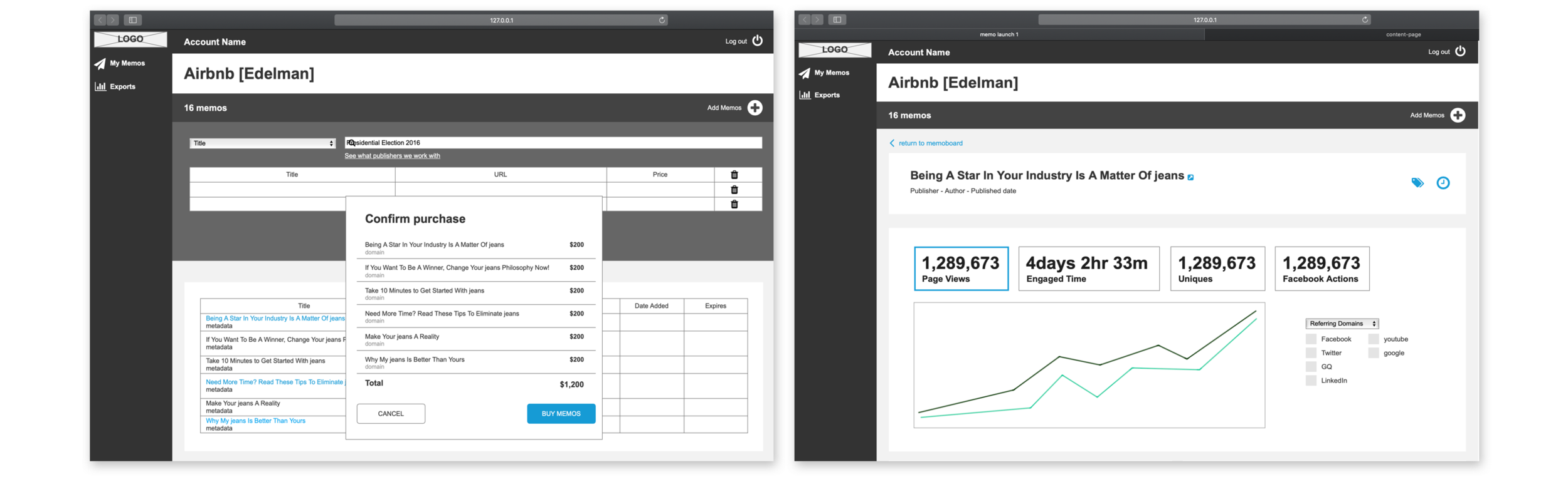
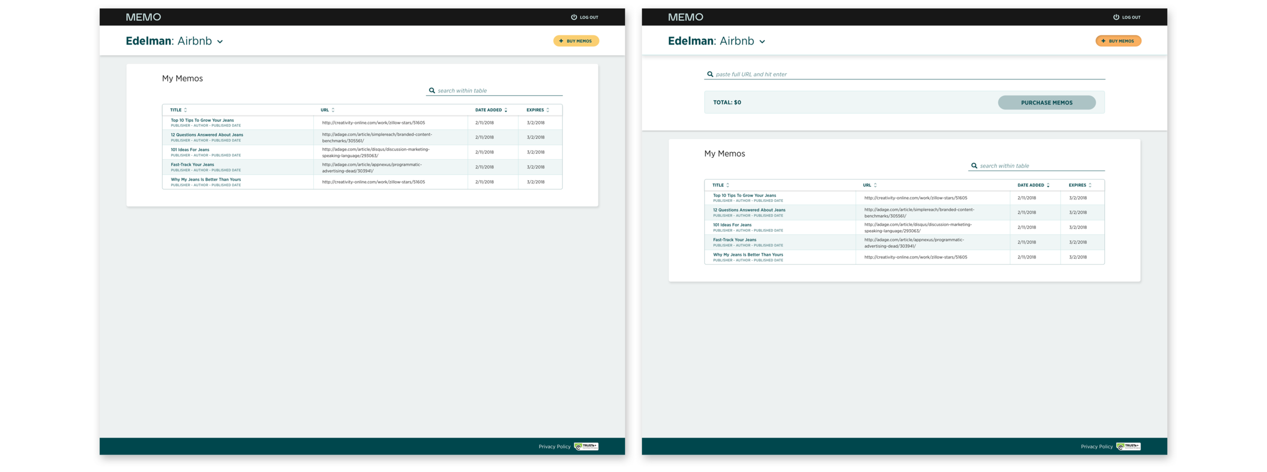
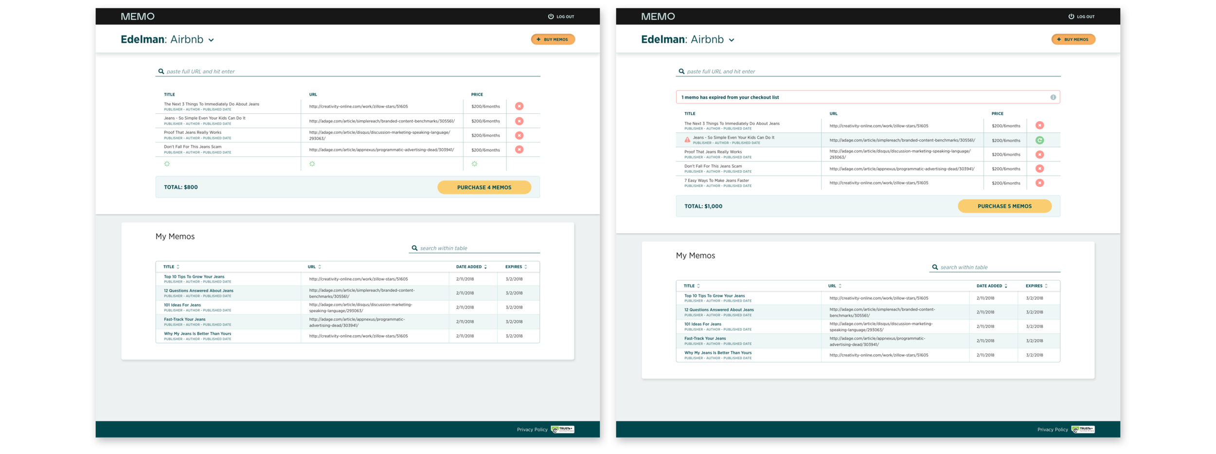
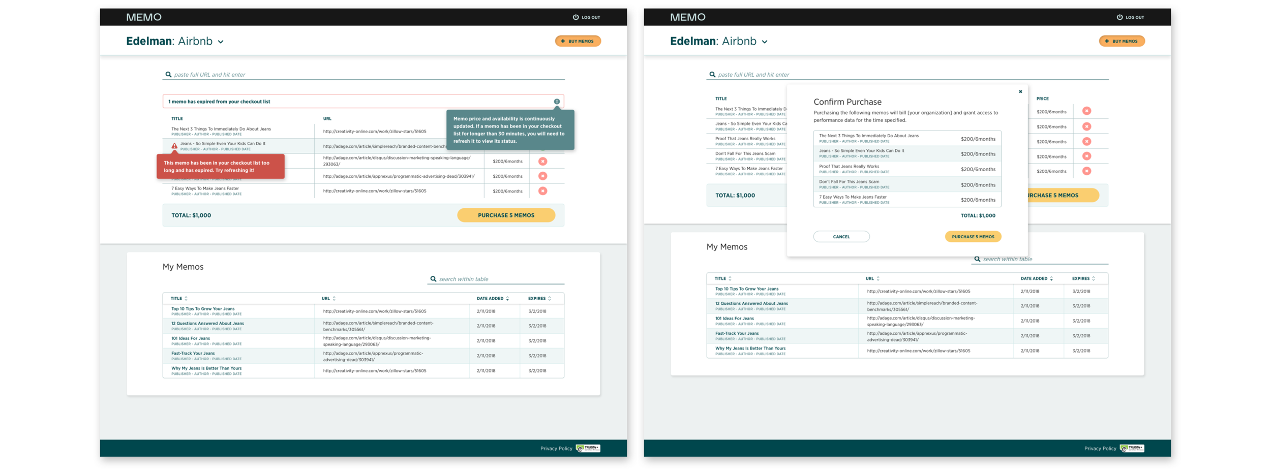
We wanted to give our potential customers of this data the quickest possible way to purchase and to always have the ability to purchase no matter where they are on the app. This is good for us to generate revenue, but also good for the customers as they can access information as quickly as possible and have that advantage for their clients. Time is a very valuable asset for people in this industry.
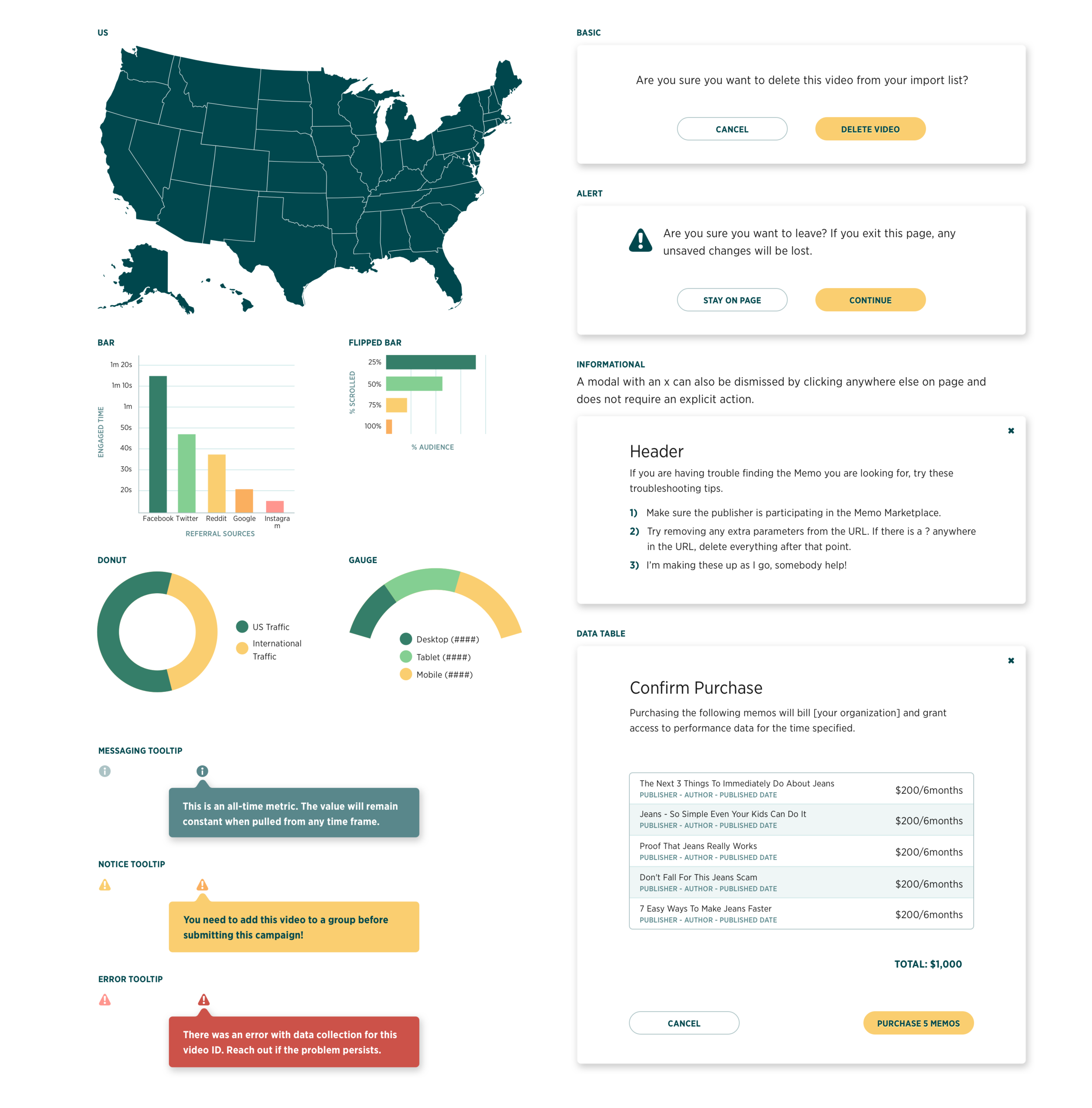
They can simply just type in any article title, or any keywords that they can think of. The search would go through all of our data in the backend and return to the users a list of relevant content from their search with the dashboard of data.
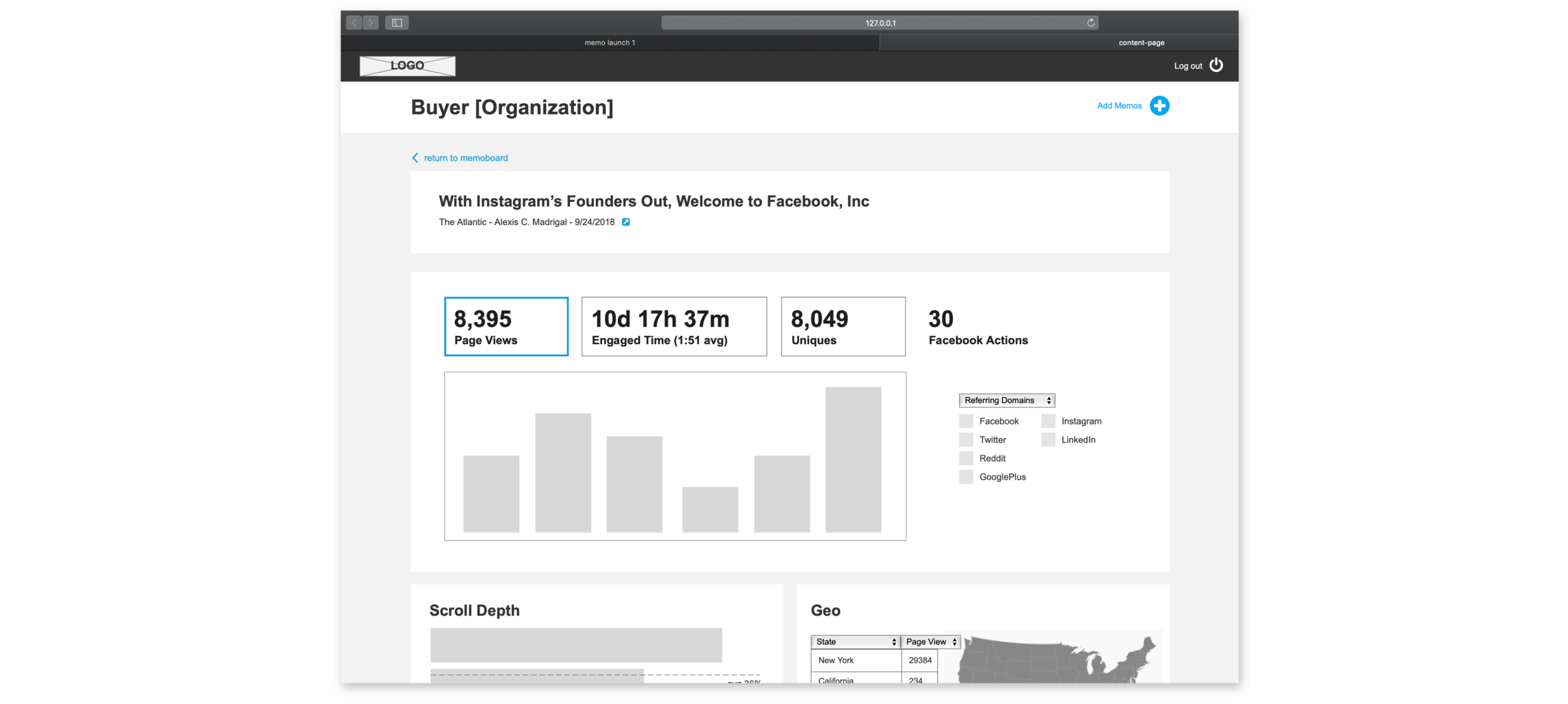
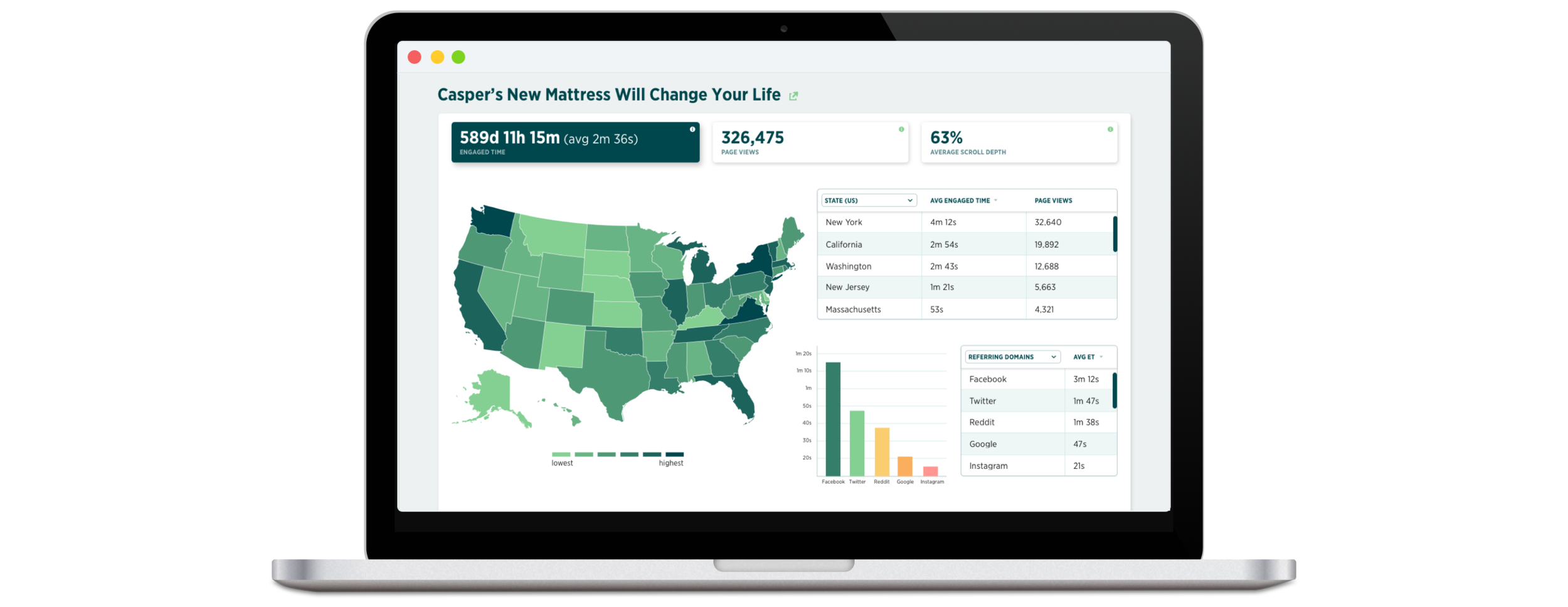
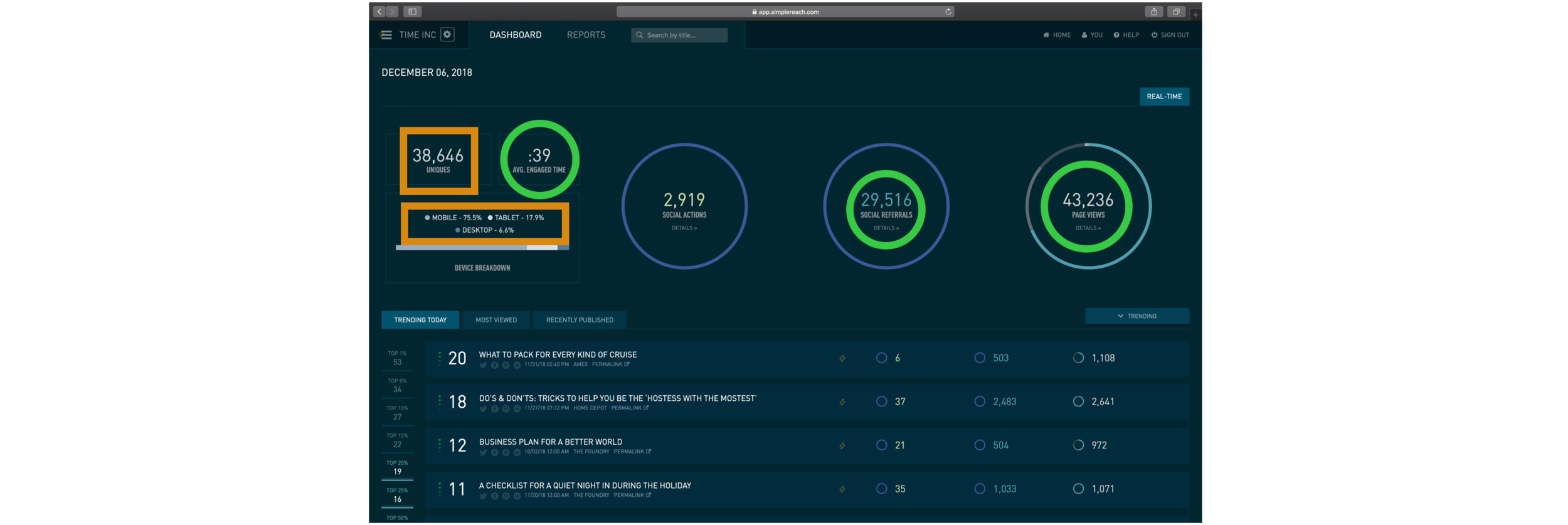
Our dashboard was one of our main selling points. This is where a lot of the work and research was done with the most amount of time and effort from the our whole design team of 2.
A few things that we kept hearing from our research with marketers: impressions and devices don’t mean a lot anymore.
They want real hard actual numbers to make insights from, and they want to see it all upfront.
After our first design iterations, a good percentage of the group we tested had mentioned that they want to see the whole picture and understand the idea as quickly as possible.
They wanted to be able to speed-read through all of this data. The only way to really do that was to bring up more of our data points to the top and reorganize some of our components.
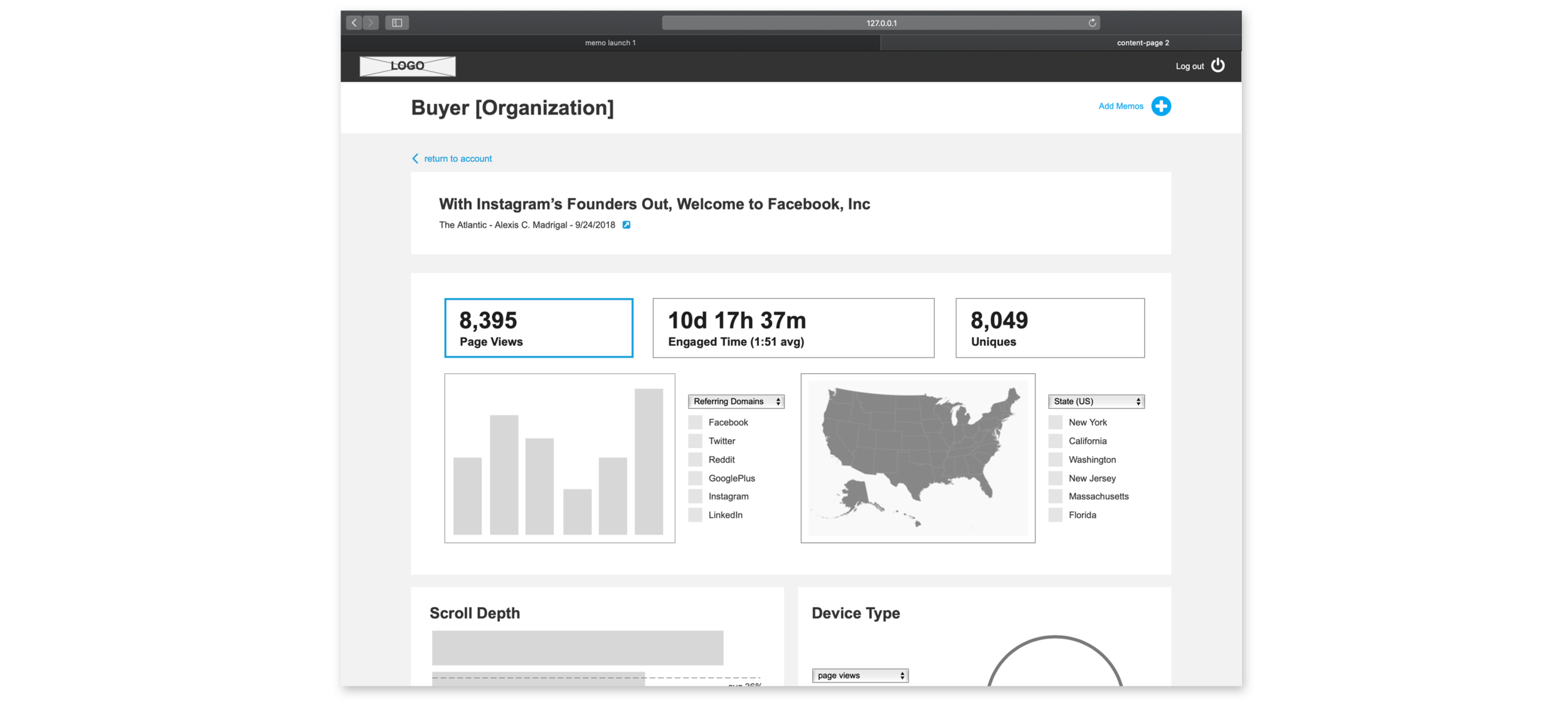
So we did just that. We brought up more data points they thought were important. We also heard from testing that this would be great for any screenshots that they would like to take and use for presentations with their clients or sharing the data with their own team. This was something that we really took into consideration.
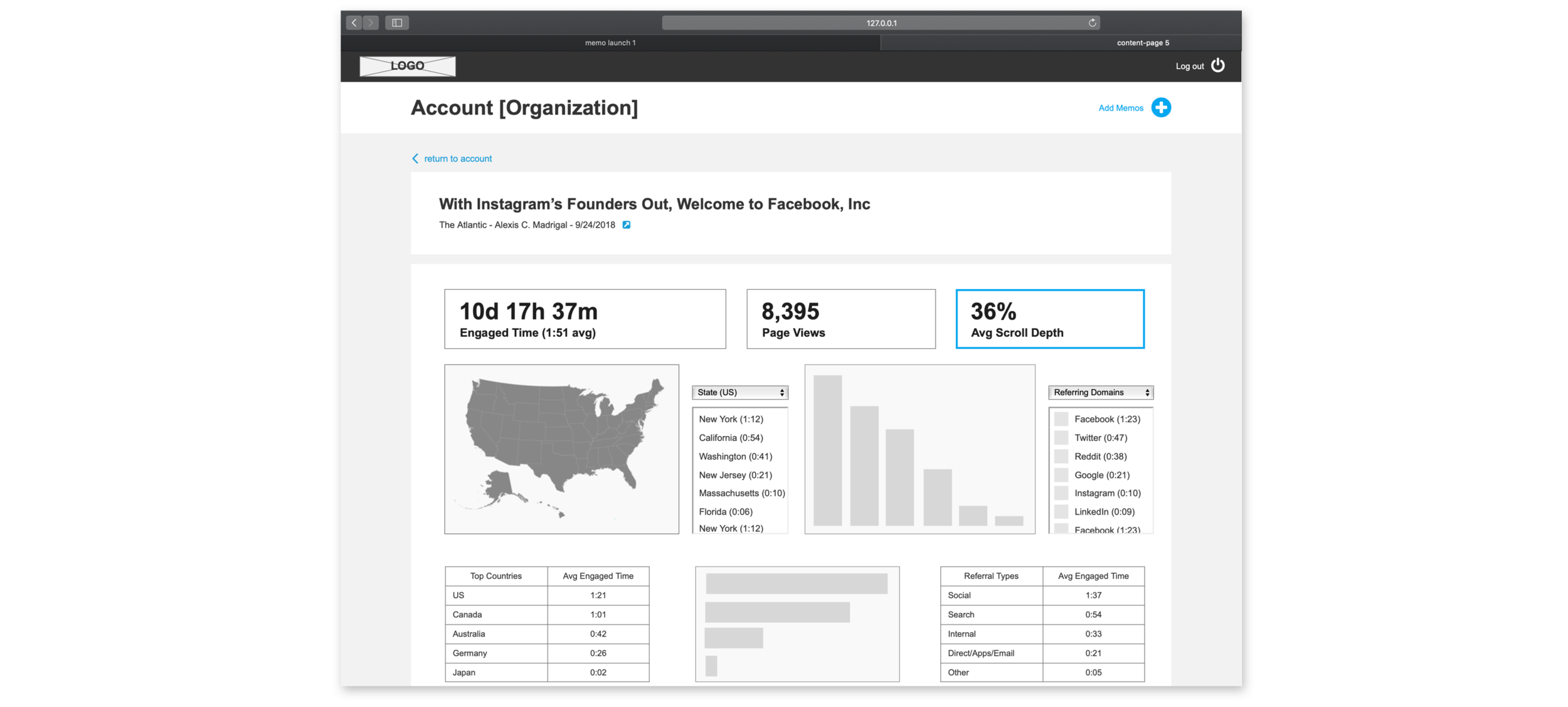
We essentially brought the most important pieces of data for the users straight to the top so they can have a quick high-level idea of the data right off the bat. This is to get a quick picture and a fast look at what they’re researching. Remember, time is of the essence for our users in this industry.
We felt that this was becoming a little too “top-heavy” (as some of our team mates have called it), but we were wrong. This is exactly what our users wanted, essentially a congested screen of multiple data points for their viewing.
We were a little thrown off, but we took our final wireframe iterations and ran with it straight into design.

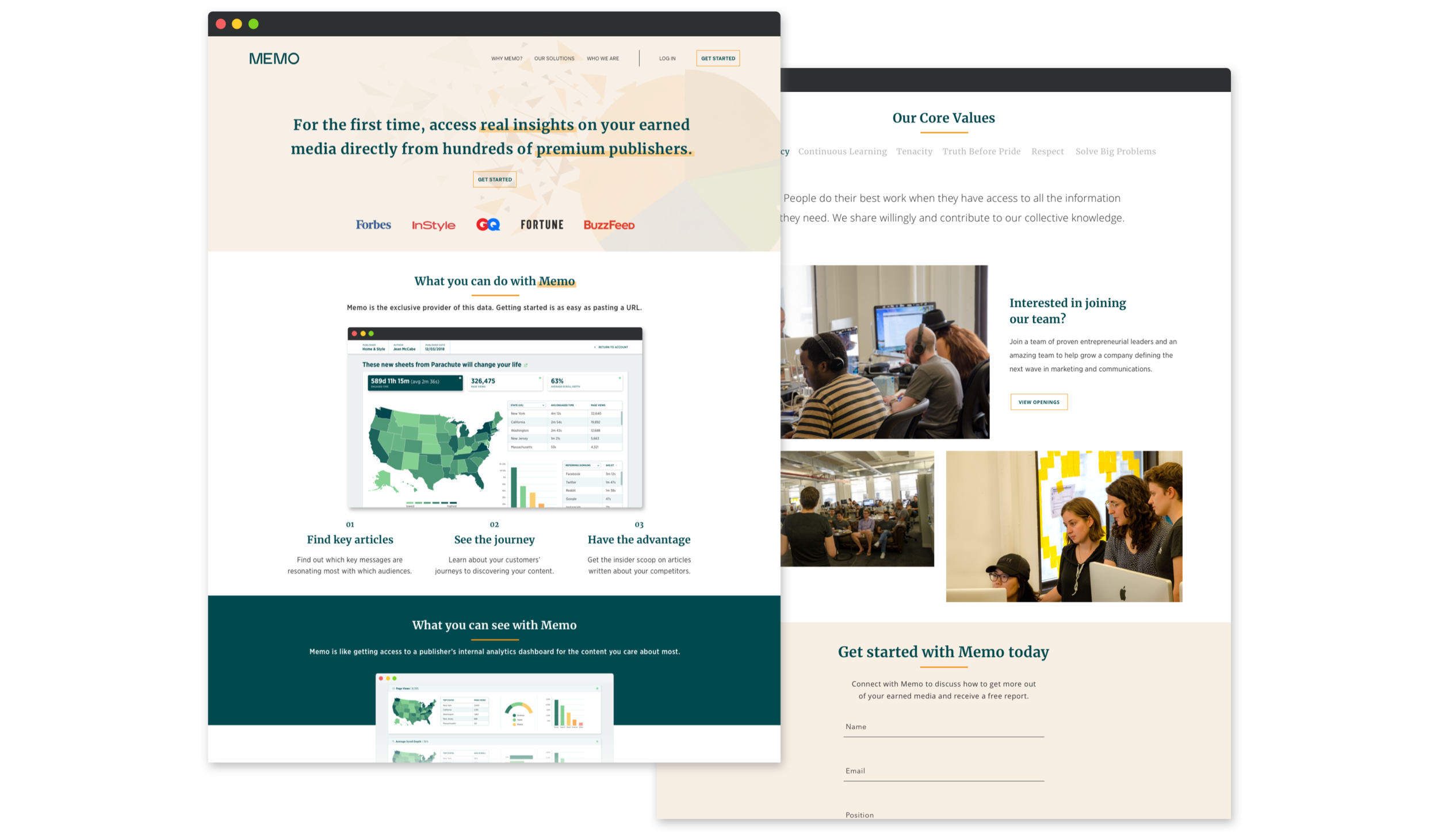
While we were working on the product, we went to look for some outside help from a few friends over at High Tide, a design agency specializing in branding work.
We worked with this team to help bring us a logo and two main primary colors to help give us this visual identity we can carry for our visual designs and marketing.
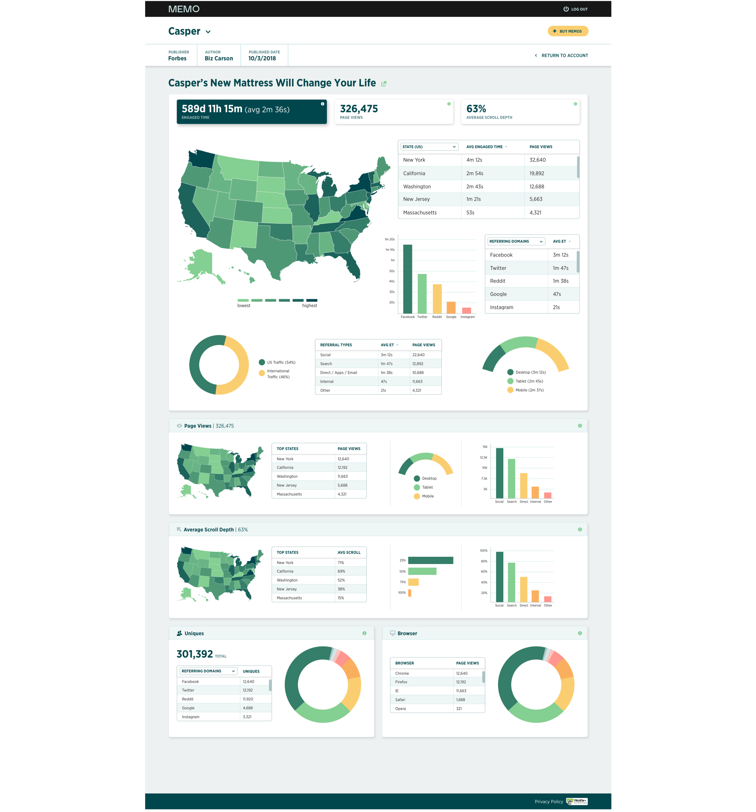
After a lot of testing and iterations of different designs, we finally came to our final dashboard that customers would use to see the article data that they had just purchased.
This screen was the most important screen as it housed the most valuable information. Getting this huge part of the application done lead us to quickly building out the purchase flow, our user management, and finally putting together a design system for this new product.
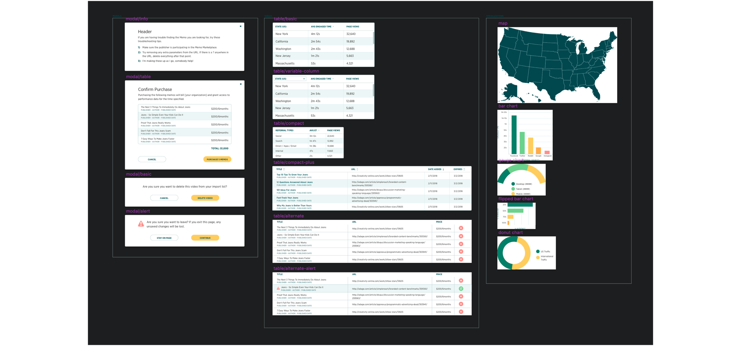
The MVP at this point is mostly built out and a majority of the features are fully designed, we felt that creating a the design system as soon as we could would be beneficial for us in the long run, especially when the product starts to grow and expand.
We knew that this was necessary as it will make designing future screens much faster and more efficient. It also helps us build this visual identity and unifying all of our designs.
Luckily, we had already been creating the design system for 2.0, so a lot of the older components still came into use. All we had to do was put our new visual design and colors on top of them and reuse them within the new application.
With the launch of our application, we started our massive email blast to every publisher we knew currently working with us or have previously worked with us before.
For the final piece of the product that we had built over the year, we wanted to tell the world what we had just created and what the new possibilities were with our data analytics application for both Public Relations agencies and publishers with content.
The marketing site work consisted of a lot of copy and structure to the page. We used our designs to help showcase the features of the app and have been gaining some attention ever since launch.
Take a look at the live marketing site right now at www.memo.co

Right after our launch, we had already been talking with a group of big name publishers, pitching our product and how it can benefit them.
After showing them our concept and designs, these publishers above were sold on the idea and signed on as quickly as they can. They knew the potential this application can bring to them and the extra stream of income they can potentially gain from using this.
This helped us tremendously as it would give our platform content ready to sell to marketers as soon as they are fully incorporated after signing up.
Lessons for me as a designer:
This was the fastest I’ve ever worked before on any project or product. The speed and turnaround for designs was a lot quicker than I had expected. I knew startups needed to be quick and act fast, but I just didn’t realize how fast until I was in the trenches myself.
This helped me become a lot more efficient in my own process and has taught me a lot about different processes for engineers, product managers, and essentially our CEO.
This project has taught me a lot about what a launch can be. How much pressure there is to the dates that we have set for ourselves and what needed to be delivered. One saying that we kept telling ourselves throughout this whole process:
“Build only what is necessary.”

