Samsung Business
The Ask:
Through a deep understanding of buyers’ needs, aspirations and anxieties, create a tailored experience that positions Samsung Business as a trusted partner in innovative business solutions ultimately resulting in high quality, long-term, profitable relationships.
Committing to a long-term contractual relationship can bring up anxieties that may draw potential partners away. Many barriers will show up for someone that is not well equipped with the proper knowledge or guidance they need to make those important decisions.
The industry is known to create this sort of knowledge barrier with long and complicated essays that would require hours of one’s time to even grasp an understanding of what the services offer.
Many companies in the industry are not engaging or listening to their customers specific needs or wants.
Our team wanted to change this idea and make Samsung the leading partner and the standard for the B2B marketplace.
My main role for this project was a User Experience designer creating the information architecture, designing the wireframes, and assembling the design system. Also took a role during the middle of the project as a visual designer.

During the research, our team spoke with many potential partners in the B2B marketplace. And we noticed that there were really two types of groups that were in this industry.
The Aspirational user:
interested in new innovative ideas and empowering their employees with the latest technology.
For these users, we’d want to show them content about thought leadership and what is trending currently.
The Preventative user:
Tries to create a stress free environment and has everything running smoothly. Looks for methods that are tried and true.
We would display pages that fulfill their needs with case studies and metrics.
Some common quotes we’d hear from our research groups:
“Less Marketing blurb, more specs."
“Sites are too busy with too much information, not getting to the point, tired to look at it."
“Tailor it towards what’s actually relevant to me, healthcare, my organizations’ needs,”
These partners would, of course, be anxious about such large decisions that they need to make. They invest their time with hours and hours of research; hours that they can’t take back and reinvest into other parts of their work.
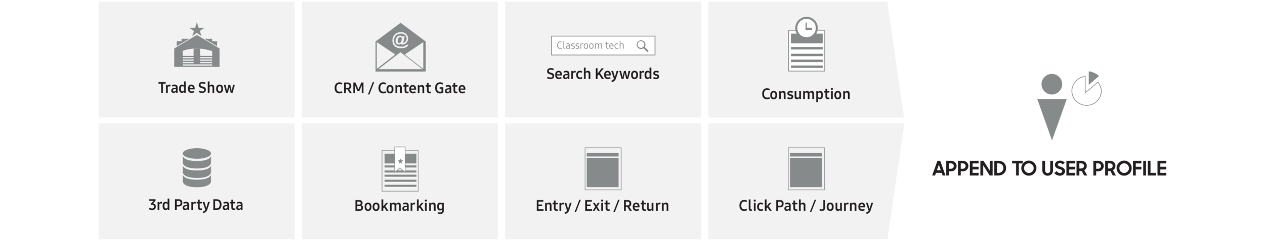
Gathering data and analytics on our leads, our component and design system would be built around a personalized experience towards the interests and needs of these potential partners.
Our team wanted to put Samsung as a leading and trusting partner, not just as a product provider.
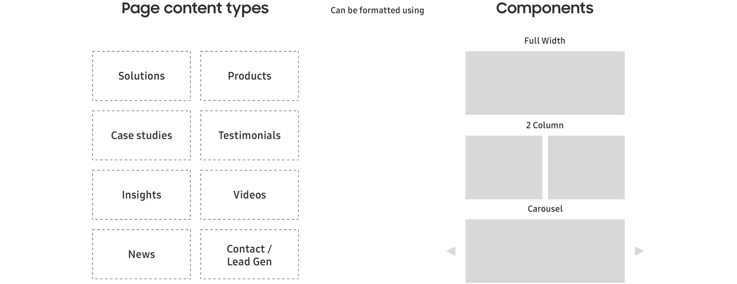
We had a very good understanding of which pages and templates we needed after doing full audit of their competitors’ websites and their very own.
Through many talks with the clients with a lot of back and forth, we settled on a certain amount of templates and a certain amount of components for the website.
After the full idea of which page template types we needed, we categorized these components based on those templates and started to funnel them in.
The components we wanted to build started with global elements that can be used on any part of the website and can be tailored towards any user we pick up from data and the previous knowledge we have of them (cookies!).
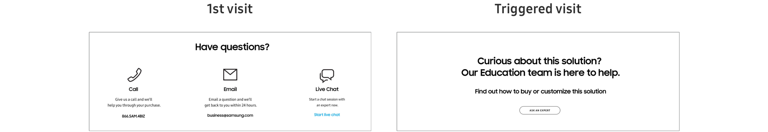
Components can have custom content in them to better speak to these potential partners. A user can come from anywhere, and where they came from exactly will influence the content that goes inside of these components.
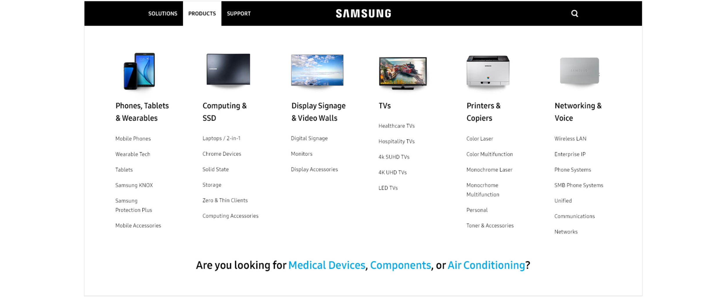
We also wanted a navigation that would showcase all the products, but also have room for some customization. This would help returning users see featured items or solutions that were more tailored on their second visit.
We saw that the user on their first visit went to go look at medical devices? Here’s a link to help get you there, or other links that might be related to what you were looking for.
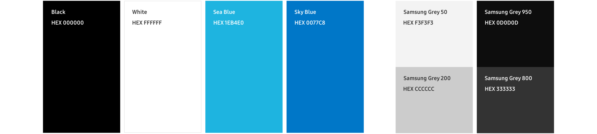
Parallel with our design system coming together, we also needed the visual design layer of the Samsung brand to be on top of all our components. We first started with our primary colors. These were crucial to the Samsung brand, as they pretty much own those blue colors there.
We pushed the exploration just a little further by adding in the black, grays, and whites to help add some accent colors to their system.

A typography system was created for any use case we might have had on our website. These type styles went all the way from the H1 to the CTA type styles. We used this almost religiously and memorized almost every typeface variation and knew exactly what needed to go in which component.
After having a system for our typography, we created a tag system using the titles of each font sizing to easily call out which typefaces were which in our spec documents for each component.
This is for developers that have already imported the CSS typestyle sheets and can quickly refer to their tag instead.
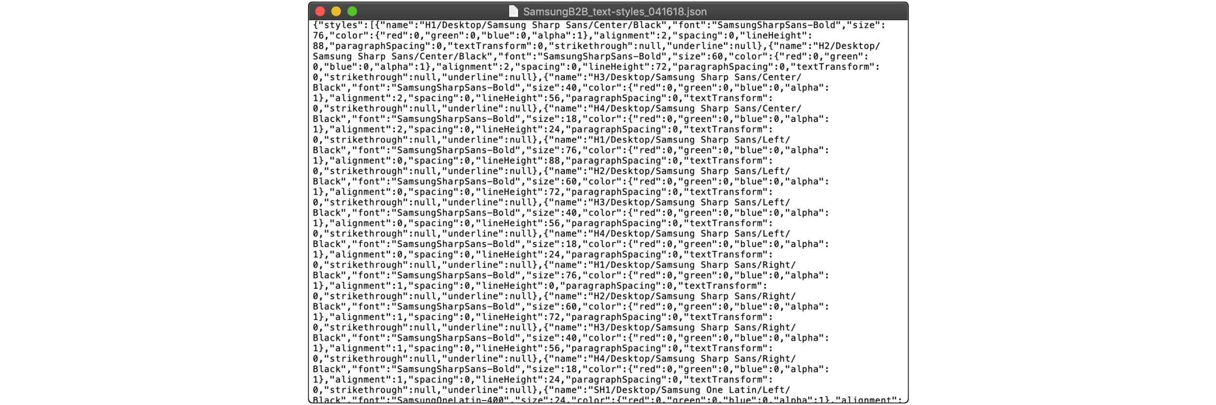
Before the very popular Sketch update, I made our process faster and more efficient.
I created a .json file to import all of the text styles so any designer can use it on any of their own files. All they had to do was download the file then import it into Sketch with a simple plugin.
(Thank you Sketch for creating this update!)
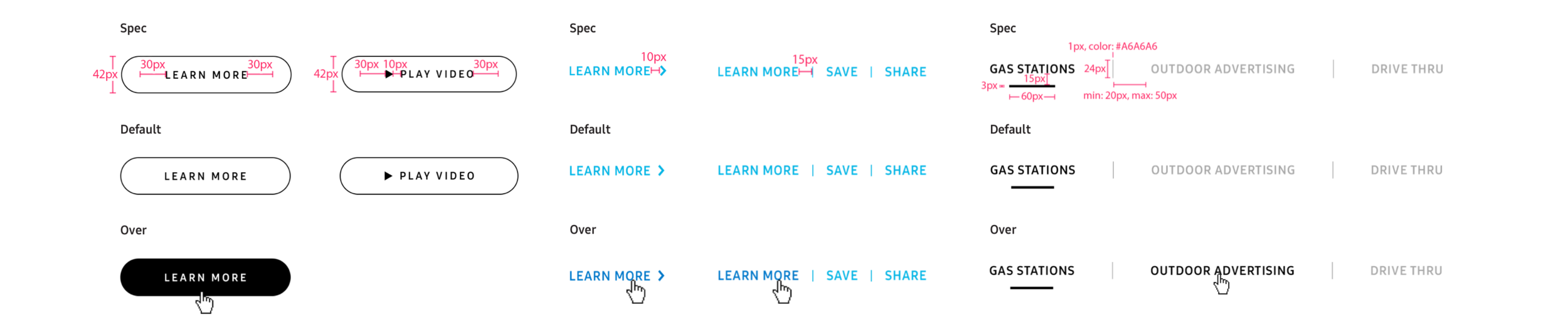
We also created the button styles for each instance. These buttons were very complex with all of the different scenarios they need to be under: Primary CTAs, Secondary CTA, Tab system, links that went to other pages, etc.
This visual design system was built using our best design practices and best guidelines for mobile and web.
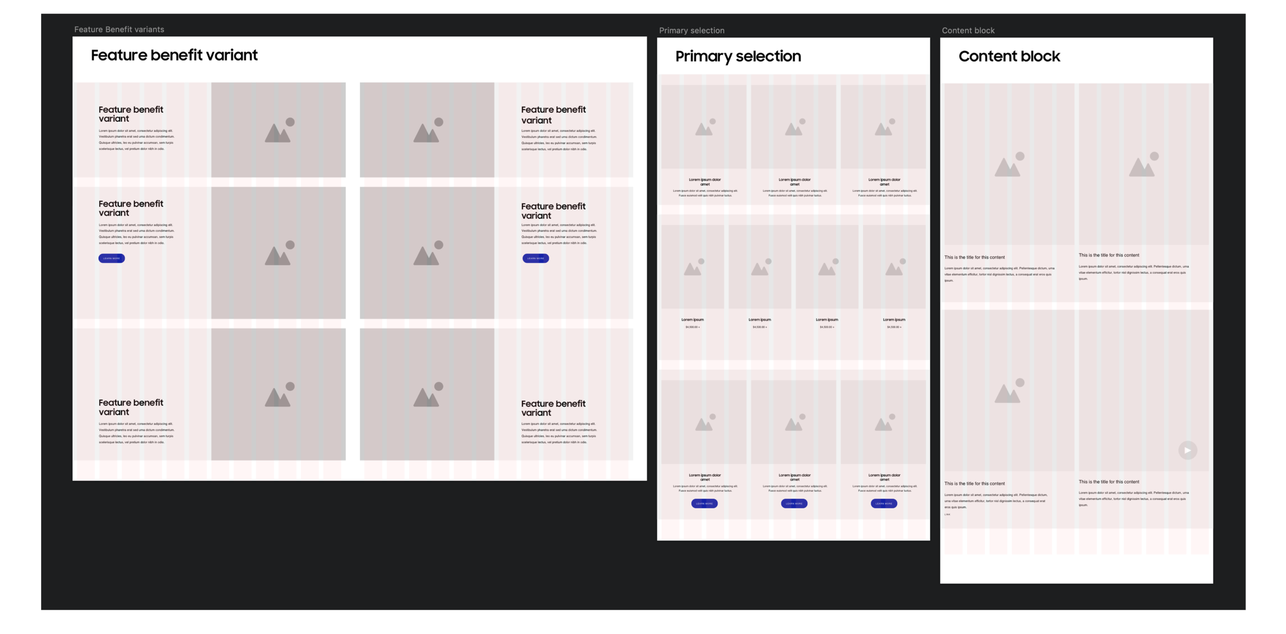
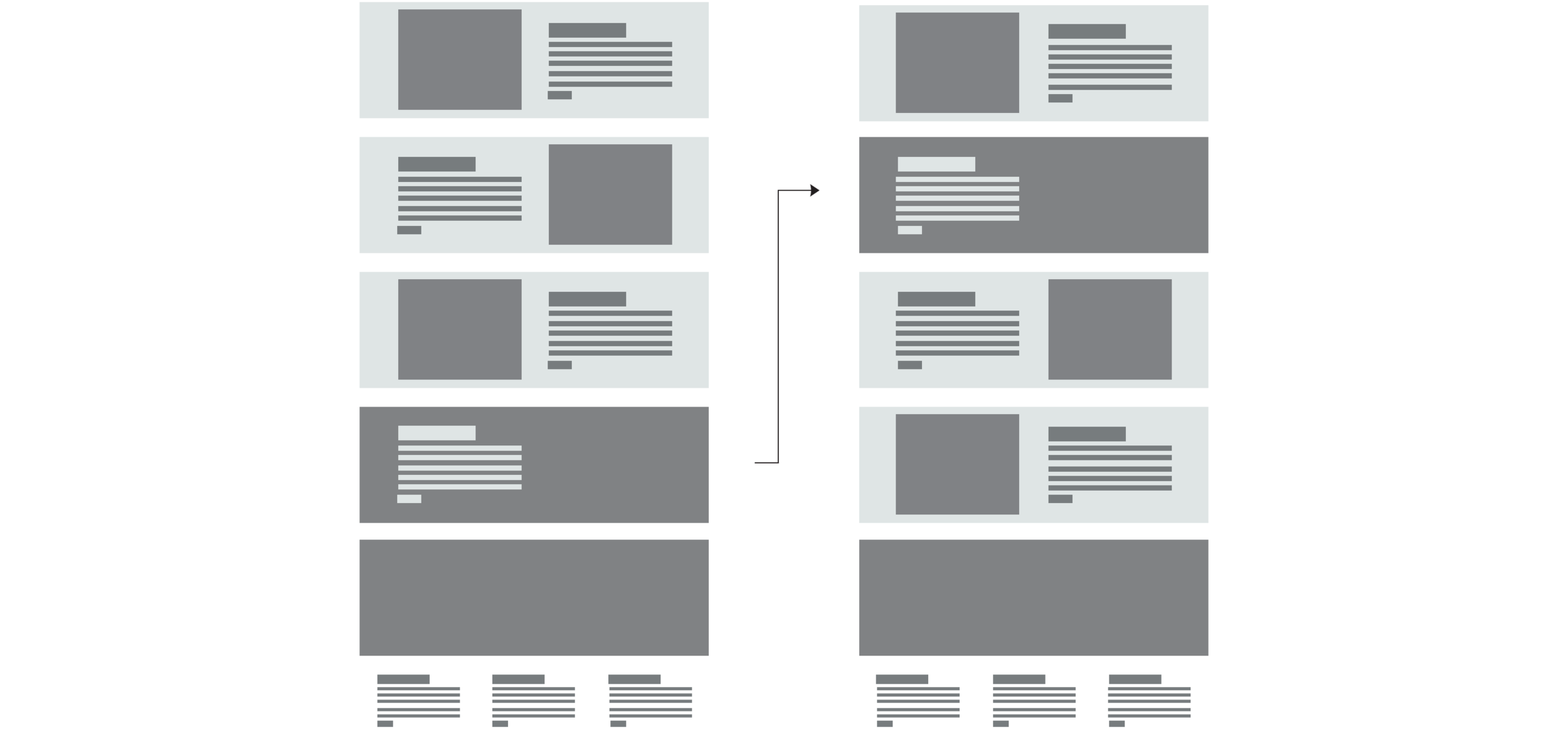
To get pages in front of our clients as quick as possible, and knowing that in the future we’d need to create these components anyway, we decided to create wireframe components. This way we can build quick and test out our ideas and solutions.
We created variations of each component and the different use cases we can use them with.
This was also very helpful for our visual designs as it was a good base to start with when putting on the visual layer.
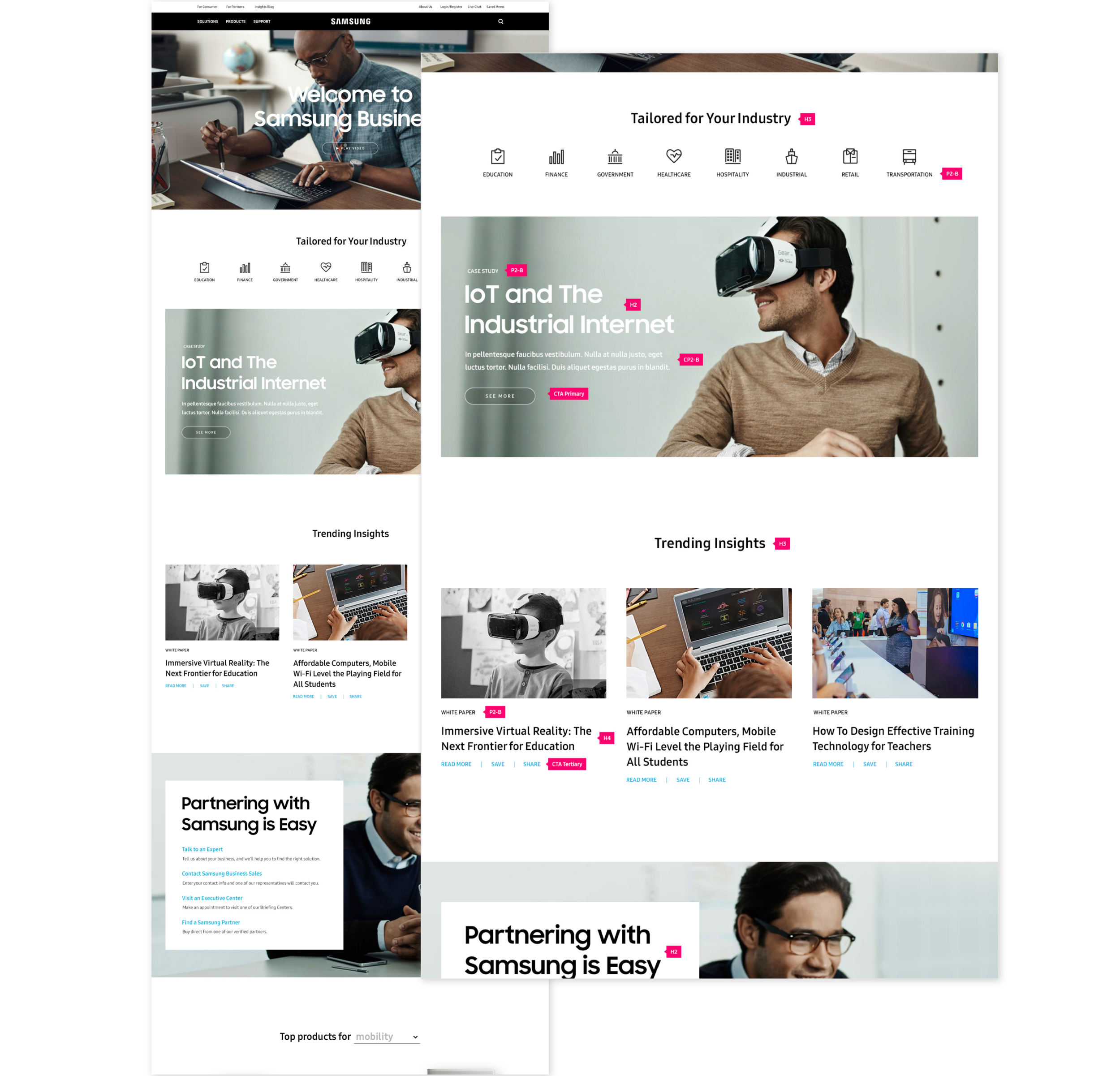
Our design system, with our visual design and strategy, came together in the end to put together an updated B2B website that was modern for this day and age. This website was better tailored towards any lead we had with potential partners.
We listened to the feedback from our clients, but more importantly, we listened to our research early on with the users and potential partners of Samsung.
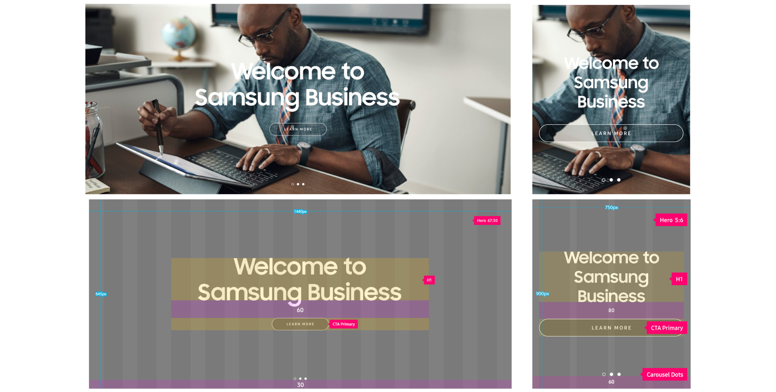
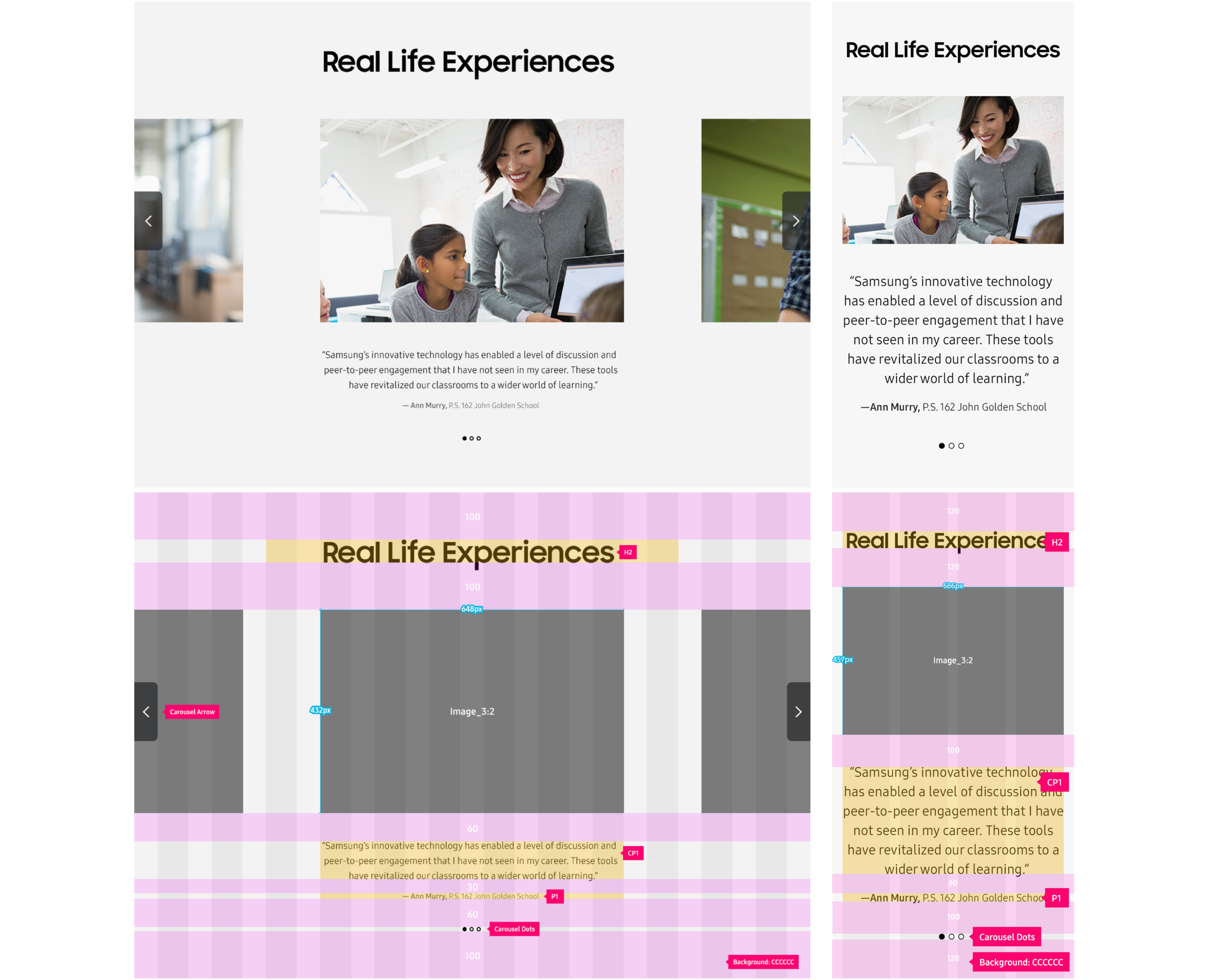
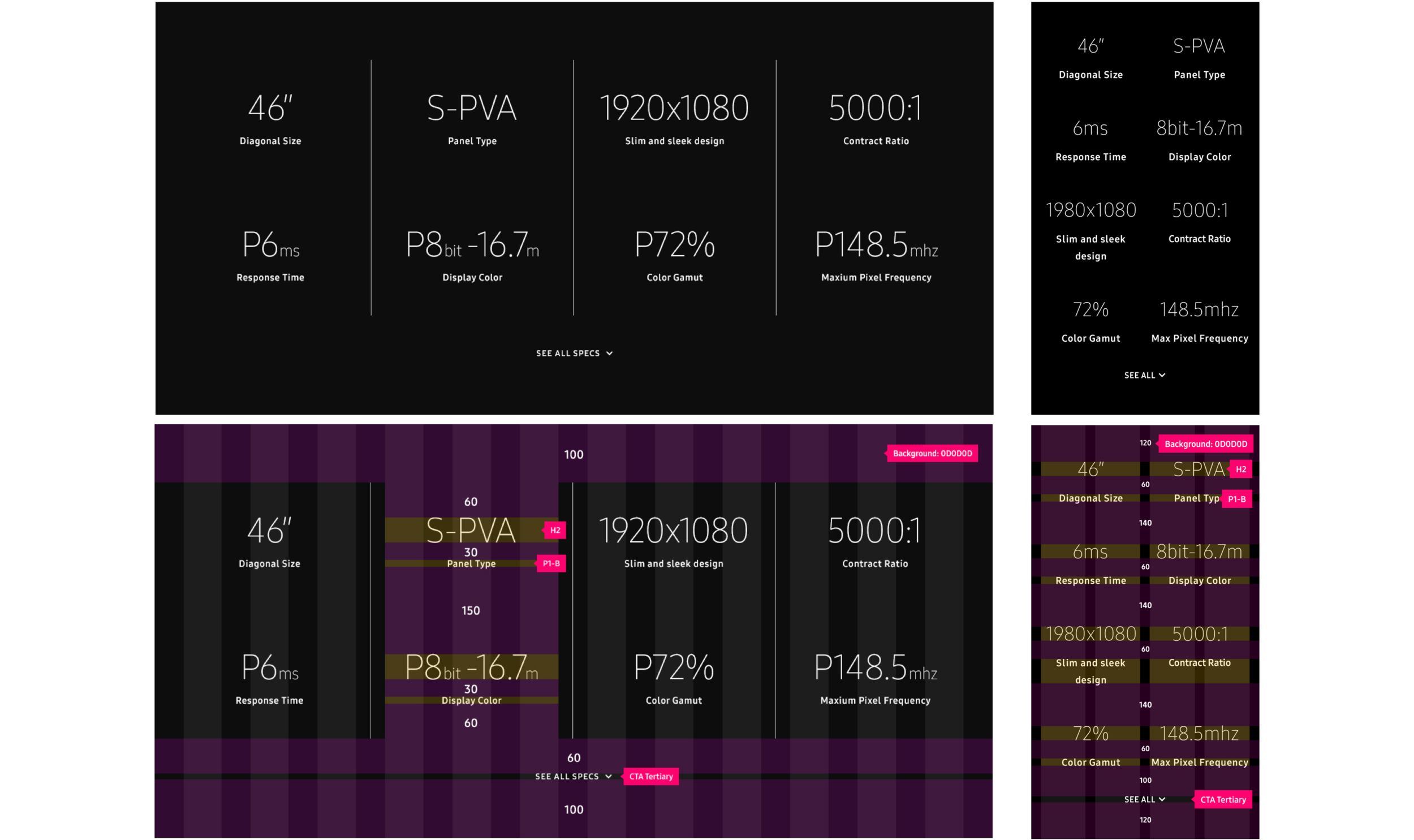
Here are some of our most commonly used components that were used to put this site together.
First time leading a team through to completion of this design system.
Learned a lot about working styles and what battles to pick and choose.
This project has taught me confidence with my own design decisions and how to help execute those ideas.
The launch and the success of this project helped our team gain another part of Samsung’s business which we would translate over our design system to eventually.
This design system is now the template to creating any design system for our clients that are need of a website as robust as this.